Question
Is there a published industry standard for color matching on stained woods, specifically regarding acceptable color ranges? We would all agree that putting the standard disclaimer on the back of finished stained wood samples expressing that natural variations in wood color and grain may affect the finished color is an industry standard and acceptable. My question is, how close do you have to be before it is no longer close enough? I realize that color matching is purely subjective for most of us and lighting plays a large part in the equation. I can find many articles on standards for color matches but these are all based on solid opaque colors and transparent colors (glass), printing, photography, etc. but not on stains and wood finish samples.
1. Is there a standard for lighting? And lighting color temperature?
2. Is there any particular method used to compare so that metamerism is not a factor?
3. At what gloss level should samples be compared?
4. At what distance should the viewer be from the samples to do a color comparison?
5. Is there a specific type of light box used to do color comparison?
The natural variations in wood color vary greatly (look at any parquet floor) and we all know this and can accept this. However, the reason for this post is to narrow down and define a color range that is acceptable and a method of defining what specific type of lighting and lighting control is to be used to do color comparisons on stain (finish) samples.
Forum Responses
(Finishing Forum)
You might want to look into ASTM International. ASTM is an organization where manufacturers, special interest groups and consumers gather to write standards on quality and methodologies for a very wide variety of markets. I personally serve on the D01.57 Subcommittee which serves artist paints and related materials.
If you want color control for the stain itself, that can be done, but a lot of it is still done by eye.
I always like to do color matching in full gloss. And if the sample I am matching is in a sheen, I wet it to see the "real" color.
Color control in large production plants is done lots of times with both "step boards" and color control samples that are the "no darker than" and "no lighter than" limits. I would lean towards a system of NLT/NDT for color control (NLT/NDT = no lighterthan/no darker than).
As for lighting, I would spec "natural daylight." We have it every day, just hold samples outside, preferably in the shade as direct sunlight is too harsh.
Bob Niemeyer, forum technical advisor
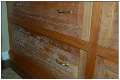
Color variation when staining is as inevitable as death and taxes. So many factors contribute to the final color that trying to keep an exact match will drive you insane. Using only select lumber of all the same color helps, but things like grain patterns, sanding techniques, staining methods, wood density and even moisture content can account for unacceptable amounts of variation.
I agree with Bob on his idea of "no lighter than, no darker than." This at least brings things into reality and will make your customers more understanding of what is achievable.
I always do my color matches in the same sheen as the sample, as finish sheen has an effect on color perception.
Samples should be compared and approved in the same lighting conditions as job site. For example, taking a piece of walnut stained a dark red brown color outside and looking at it horizontally will produce a lighter perception of the color than if the piece was inside and placed vertically, such as in a kitchen cabinet door.
I have seen this happen all too often, resulting in a customer that is unhappy with a too dark color (not to mention a boss who lets blame roll down hill). The color was a good match to begin with, but approved in the wrong lighting conditions. Having said all this, color variation is natural, and is part of the beauty of wood. Things don't look right if it's all the exact same color. As an old finisher I learned from used to say, "If you want it all the same color, paint it, don't stain it!"
However, I guess I'm looking for a standard for lighting and distance to judge samples so that grain variation is minimized, etc. so that a truer and fairer comparison can be made. In other words, so that all of the above does not play a factor in determining color. Natural sunlight is out of the question as the intensity will vary depending on your geographic location and time of year, weather and time of day.
So, under controlled conditions, what would be an industry standard for lighting? Type of light and color temperature? What would be a standard for distance the sample would be viewed at? We use control samples for all stock colors.
My question is actually geared towards color matches from samples that are provided to us by the customer. An exact match is nearly impossible, we would all agree. But how close does a sample have to be to be considered close enough? I realize that this is nearly impossible to answer, but I think we have all been in a situation where the customer and you can't agree on what is close enough. Hence the need for coming up with some standard so that there is some sort of acceptable range of color variation with regard to tone and hue.
And if you have dealt with customers on this issue, you know that no amount of talk about conforming to acceptable standards will console one that is unhappy with a color match.
Comment from contributor A:
There are several color matching machines that do excellent matches, but not on every single sample. In some cases, it still takes the human eyes to actually make the adjustments and corrections. In music, some people have perfect pitch. The same thing applies to color matching - some see true colors, while others do not. I can teach you about colors, but I cannot make you see the true colors.
My advice is to get a signature on every sample, give the customer a finished sample, and then make a new sample of the completed work. It must be the same as both your sample and the customer's.
As we faced this problem we decided that like most companies, our lights (white fluorescent) were not going to work for judging color. None of our upper level customers would have white tube lights in their homes, so we set up a standard on lighting wherever we judge color and replaced those white tube lights with (orange) daylight tube lights. A bit more expensive, but they last longer. We mounted them all at 8.5 feet high, 4 feet apart, and however long the area needed to be. We took all windows with directional sunlight and painted them over, or put covering blinds on them. We observed that directional light, which changed as the day went on, changed our ability to see the color.
No more color calls out of the white lighting. While our kelvin level is higher that the 6500 mentioned in another comment, we wanted to go higher so that we could see all defects and not have our customers find them. Overseas in some underlit areas where we work, the color calls are made outside, due to poor and white lighting. This works only when the sun is out. A cheap halogen or just a incandescent trouble light goes a long way to color matching.
Additionaly, you have to fight with different finish vendors trying to do the same finish. So metamerism and coyantance are serious matters which need to be addressed at the point of the design of production finishes, at the point of actual finishing, and with old and new product setting together. Remember, a "natural" metamerism can happen on your lighter finishes on woods that have natural wood color changes, like cherry for example. We stress test all of our finishes under UV lighting to age them fast to see what they will do, and what the finish will do. Sometimes this test can be a life saver.
So the short answer is to standardize your lighting, match the lighting with whosoever your final customer is, and keep on testing and checking. Keep your master color panels stored in the dark, replace your reference panels at least once a year, and more often if the finish or wood changes.